Ever since I started using New Relic I’ve been seeing a number for Apdex. Given that whenever I see a floating point number I presume that the calculation will be too complex for me to understand I just presumed that it was some kind of mystical number voodoo.
Turns out that it is not. It’s actually really simple. First of all, New Relic didn’t come up with it at all. There is an apdex.org website created by a consortium of different companies. New Relic just did what any good tech company does and used it to their advantage.
In Excel spreadsheet formulas calculating the Apdex is done by taking an arbitrary number that represents your SLA goal, or some number below. That is your baseline. If the page response time is below that number a user is considered “Satisfied”. If the response time is over that number the user is considered “Tolerating”. If the response time is over that number by a factor of four they are considered “Frustrated”. In other words if your baseline is 500ms any user below that is satisified, above, tolerating, above baseline * 4, frustrated.
The purpose of this is to get rid of raw response time measurements as the goal. It, to some degree, gets rid of the 95% rule.
To calculate an Apdex score create an Excel spreadsheet and have the first column be your Satisfied count, the second your Tolerating, the third your Frustrated and apply this formula to it: =(A2 + (B2 / 2))/SUM(A2:C2). That is the Apdex score. It is the number of satisfied users plus the number of tolerating users divided by two divided by the sum of all three.
Here. Let me show you what that looks like.
| Satisfied | Tolerating | Frustrated | Apdex |
| 95 | 12 | 3 | 0.918182 |
| 76 | 10 | 20 | 0.764151 |
| 60 | 20 | 50 | 0.538462 |
| 20 | 50 | 50 | 0.375 |
| 0 | 0 | 100 | 0 |
The score is on a scale of 1 (all users satisfied) to zero (all users frustrated).
What is the time scale? Whatever you choose. Your Apdex score is calculated based off of whatever time frame you have specified. Personally, I think a rolling Apdex is a good idea. But I didn’t really get a proper view of the number until I took these numbers and put them into a multi-axis chart. The bars are the total count for requests in each of the different categorizations and the line is the Apdex score.
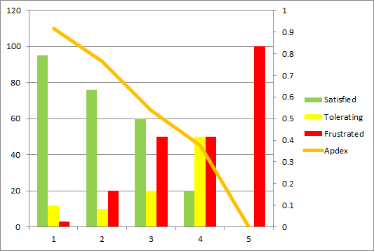
Seeing that corresponding with the raw values helped me to understand what I was looking at for all these months.
Comments
viveksarabu
Could you please share APDEX plugin for jmeter listener.